Background
Data.ai Intelligence is an enterprise SaaS platform that provides estimates of metrics for the mobile market. In early 2022, the company was growing their features and enabling analysis using AI enabled metric estimates through proprietary algorithms. In the previous year, a set of new products provided a unique app and game classification called App IQ and Game IQ. These new products were delivering $2MM in ARR through upsell and pushed the company’s competitive advantage.
Another area that had potential to drive revenue was the advertising data. There was a single report that enabled mobile teams to review scraped creative and AI estimated data for performance. The C-suite leadership wanted me to spearhead an overhaul of the creative report to deliver the same revenue potential as the other “IQ” products. This was branded as ‘Creative IQ’.


As I joined data.ai, the design and product teams were struggling to gain clarity on the strategic vision of the product. I was placed on the team to lead design and UX and deliver a highly polished, premium feature set. The vision that I provided was focused on the key outcomes our customers needed for the existing reports and where we could add additional value with existing data we collected from panels and from scraping.
Vision
The vision for Creative IQ was centered in core flows marketing and advertising teams would need:
- Provide a clear, more visual gallery of current ads
- Identify trends in ad creative
- Preview of ads with relevant data associated with the ads
- Enable unique collections of ads for team analysis
- Deliver accurate estimates of ad and network performance
- Share of voice
- CPI
- Return on Ad Spend - ROAS
- Unique filters for ad networks, ad types and brands
- Deliver a visual and interactive experience to meet or exceed the existing IQ products
Design Process
|our product feature design process started with research, discovery and documentation and then the design workshop where the product was fully visualized
- Quantitative Research
- Customer Feedback
- Qualitative Surveys
- Consolidated Insights
- PRD
- Workflow Mapping
- Wireframes
- Data Science
- Visual Exploration
- New Component Definition
- Prototyping
- Agile Sprints
- Design Reviews
- In Process Updates
Inputs & Analysis
The design vision was informed by qualitative research that our UX research team had performed in the previous quarter. The team conducted 15 interviews with existing clients, across our main key verticals; software and gaming. These interviews were each an hour in length and consolidated the core flows that informed the design vision.
We also leveraged our larger research that focused on identifying the “Jobs to Be Done” across our SaaS platform. The findings provided reinforcement of the findings from the qualitative research. The “Jobs” identified were narrowed to just the creative and advertising areas of the research. With this research, the team understood what outcomes our customers were working toward. The research showed that the data provided was helpful, but also incomplete. Additional data modeling for CPI and ROAS were critical to the marketing teams. This data, however, was not readily available in our existing data lake and would need to be gathered, modeled and tested for accuracy prior to launch.
Execution
While the data science and backend engineering teams worked on getting the data collected and modeled, the design and product teams began conceptualizing the product. I was meeting weekly with the design manager and lead designer to discuss progress. One of the design challenges was based on the circular nature of our existing IQ products and working to match the level of polish while also exposing the rich analysis our data science team would (hopefully) enable.
The Ad Gallery
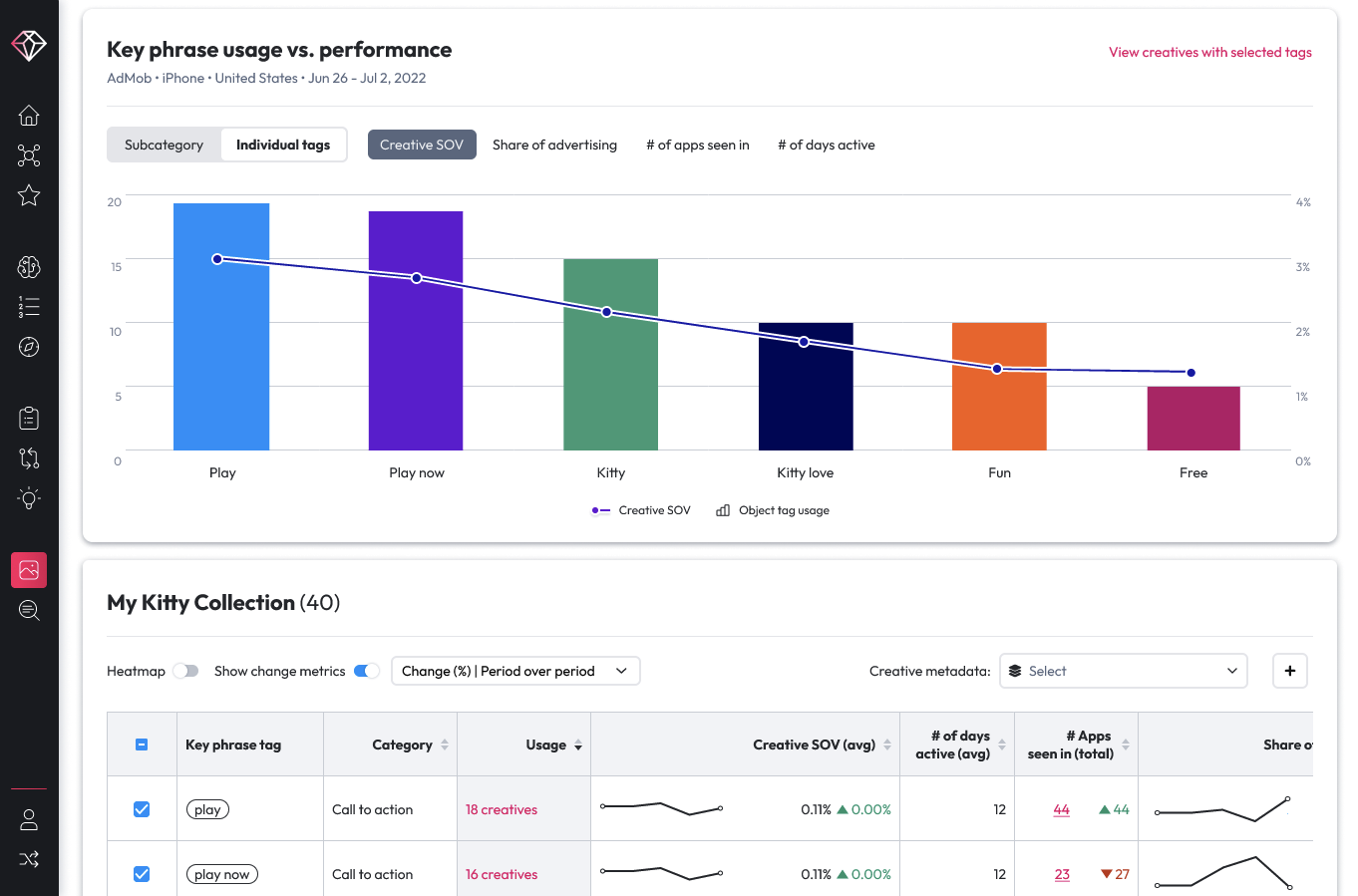
Many ads are oddly sized and the team accommodates the variety of sizes using a dynamic grid layout for a gallery which came together in the first iterations. The layout enabled a responsive column layout while also having a flexible height for each grid item. Using cards for each of the ads also delineated ads and ad types from each other, making it more intuitive as the user scrolled. Each card would expand in a lightbox style, exposing the rich data modeling provided within.
Creative Classification
One of the most important goals customers identified was filtering and searching ads. Our current report categorized based on ad type, but we wanted a deeper, ML driven analysis that would provide the activity depicted, color, and mood. These additional categorizations mirrored our deeper app and game classifications. The additional ML driven categories unlocked a deeper search functionality for brand and marketing teams. For example, if a customer was launching an exercise app and used a green or blue color palette, they could easily find ads that depicted running or exercising using the selected colors. The data science team delivered their AI/ML data, collaborating closely with the squad to communicate expectations. The design team was revising and iterating as some proposals proved too demanding for the level of data available. ROAS was one of the items that remained too incomplete for us to accurately estimate. There wasn’t enough data from the bidding and first-party ad spend. The team did a great job adjusting the mockups and prototypes to match the data modeling.

Landing Page
Delivering the landing page for Creative IQ was especially challenging. In the SaaS platform, the IQ products are a paid upsell. The deeper analysis features are locked off, with only the landing page functional to prompt users to contact the sales team for demo or upgrade. With my vision was to have a high degree of polish and interactivity the team’s initial explorations were highly functional, but not impressive. The project was also at risk of falling behind and missing a key launch. I met regularly with my colleagues in engineering and product and worked to adjust priorities of other projects to free up design resources to collaborate on the landing page. I was also meeting weekly with the design team, reviewing design explorations, discussing interactions and potential solutions. I pushed the team to prioritize the visual impact over the possible push back from our front-end engineering team.
Validating Design
With our version 1 complete, I advocated for a remote qualitative usability test with our customers and customer proxies. We tested the design prototypes with 20 mobile marketers, marketing analysts and creative directors in the mobile ad space. The findings of the testing delivered key learnings:
- The landing page was clearly understandable and navigable
- We needed to simplify our filters
- Deliver contextually relevant, actionable insights around cost and spend

Outcome
The result of the extra work and effort was a success. Three weeks before fully complete, I started reviewing the progress and vision with the CPO, garnering buy-in and support for the level of effort the product entailed. I scheduled dedicated time with the engineering leaders to build support for the complexity of interactions and the new design patterns this product would require.
The final design exceeded expectations. I first reviewed the final design with my CPO, with my designers taking the stage to provide a detailed demo. I then worked closely with my design manager to deliver a presentation to the CEO. He confirmed the success of the design vision and recognized the team with a company-wide announcement and award. He then asked us to prepare a prototype and script to present to the board of directors.
Unfortunately, just as the engineering teams were working on the landing page design, our data collection for advertising suffered a critical outage with the advertising data reduced by 80%. The product was deprioritized until the data collection, modeling and back-end engineering teams could rebuild the ad scraping pipelines and restore the lost data.


data.ai Top Apps


