Background
Data.ai Intelligence is an enterprise B2B SaaS platform that provides estimates of downloads and usage metrics for the global mobile market. In early 2023, the company was facing greater amounts of churn in our small and mid-market accounts. The small to mid-sized accounts were important to driving greater revenue over time, since our sales team could scale the product feature packages as they grew into larger, more mature businesses.
Across all the data.ai accounts, the most often set of reports is the Top Apps reports. These reports provide daily updated information on app store rankings (actuals), download and usage estimates and additional AI generated estimates for revenue and usage. Since most app publishers understand the importance of app store rankings, this report provides the introduction to using the data.ai Intelligence platform.
Input & Analysis
Product usage analysis uncovered a critical pattern of platform usage and engagement necessary to increase the retention rate of these accounts. Initial engagement was really about 2 factors; 1. Depth of engagement and 2. Custom analysis.
Our product analysts developed an engagement framework to estimate probability of account retention after 12 months. The framework was founded on the first 60 days of product usage, the number of reports visited, of user-generated app groups or collection of apps, and the number of actions or filters applied to any report.
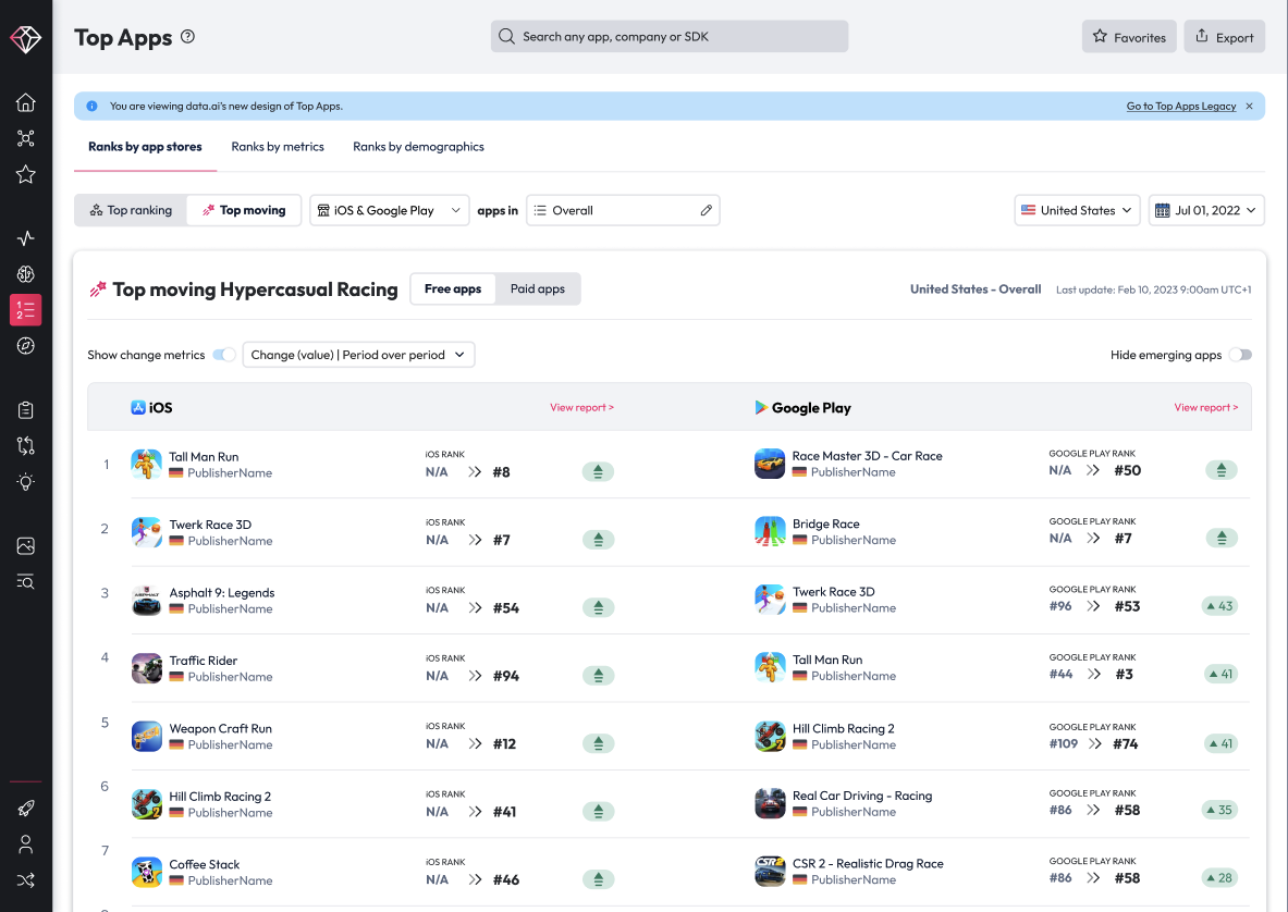
Across all accounts, our Top Apps rankings reports that provided data around app store and metric rankings were used most frequently in the first 30 days and the gateway to deeper analysis. This report suite was called ‘Top Apps’ reports. It gave an overview of top ranked apps in apps stores across the world and provided additional reports for downloads and usage trends, demographics and featured apps.
Usage patterns of the reports in our most advanced users were consistent, but were showing sporadic patterns in the small and mid-market accounts. The trends were repeated across our major markets in NA, EMEA and APAC. It was clear we needed to make this report suite easier to use and more approachable to our SMB and MM customers.
Strategy
The strategy for the Top Apps redesign was focused on two core areas:
- Simplify the report
- Update report structure to clearly delineate between ranks and metrics
- Adjust report filters to reduce clutter
- Improve time to value
- Better data formatting to allow for comparison
- Cleaner visuals for rapid digestion of data
- New Demographics Features
- Better discoverability
- New visualization for improved analysis
Execution
At this time in data.ai, one of my core responsibilities was to ensure quality and execution of the product designs and to hold the teams accountable for our Time to Value KPIs. In the initial discovery stage of the project, I set up cross-functional meetings between product, design, and our customer account and success managers to better understand the key use cases our Top Apps product solved for.
The notes and outputs of these meetings, plus the existing feedback from customers, were clear that while the product was robust, too many features were buried in report configuration filters, submenus and conditional settings like timeframe and device. The main focus of the design effort was to simplify the most important features and flows identified in our analysis of usage. One of the most important uses of this report suite was to identify apps that are growing exponentially in downloads, usage or revenue, or that are moving up the store ranks quickly. Quickly finding those apps that are top movers in a market or geo is important to understanding the competitive landscape, analyzing new trends and finding potential partnerships and investments. Another key design focus was to simplify the report analysis between store ranks and app metrics.
Top Apps Navigation
The first big change in the report was recognizing that the major divide in the report was really across two major data sets; app store ranks and AI generated download and usage metric estimates. The current product was split between our proprietary app category taxonomies and the App store rankings to sort and filter the metric data. It was that split between store and metrics that customers found confusing. Download and usage metrics were critical for app performance analysis and enabled customers to filter store rankings critical for different verticals and business models. For example, a casual app may just care about downloads and 30 day usage where a social media app would rely on average sessions/user and session length.
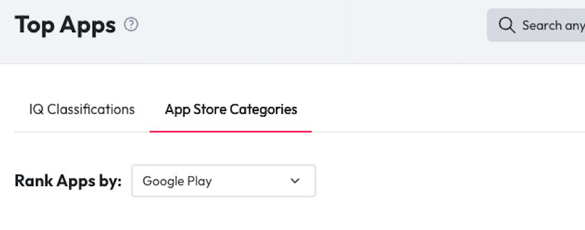
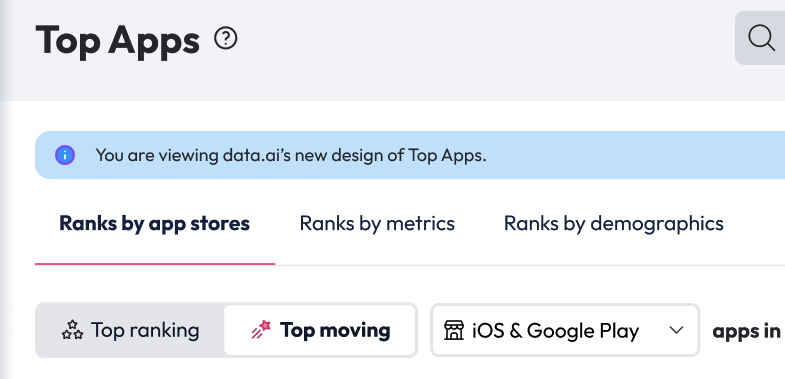
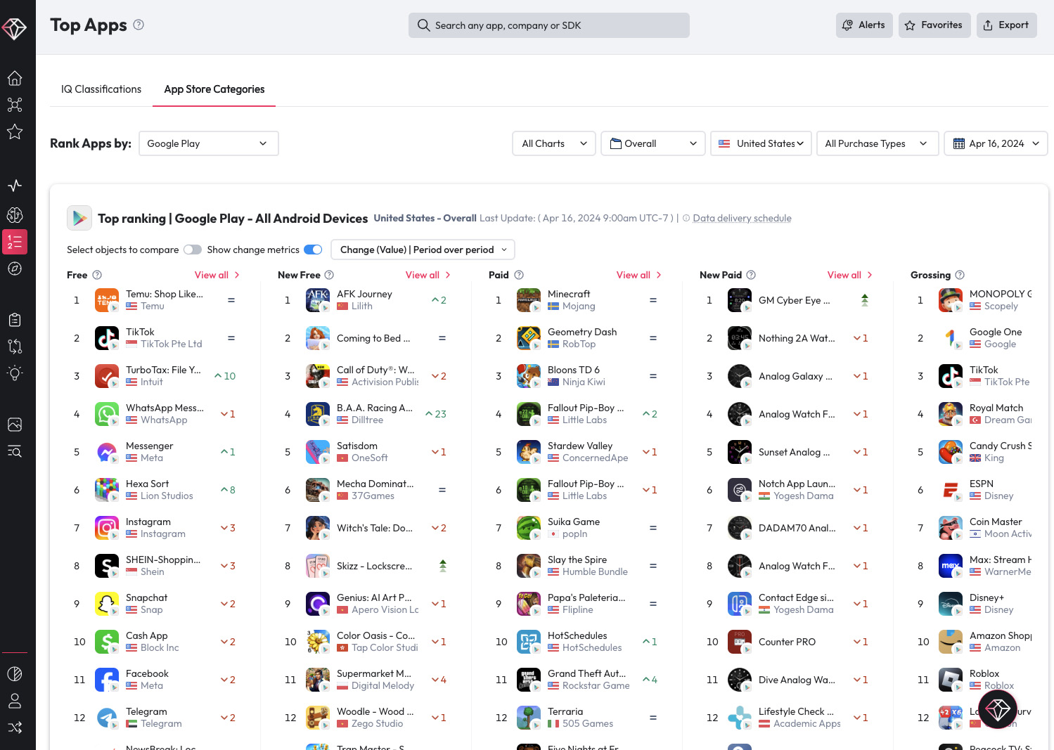
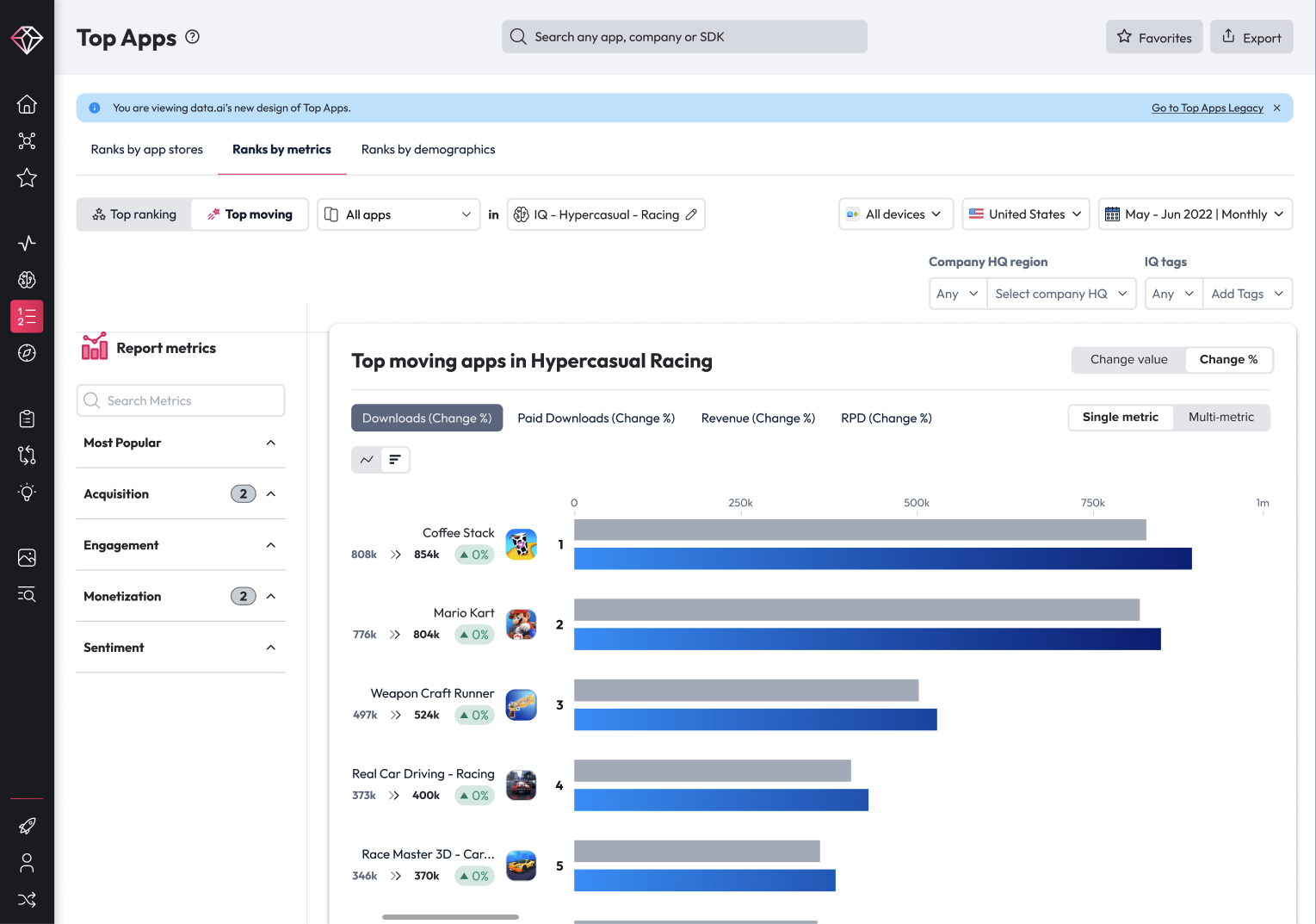
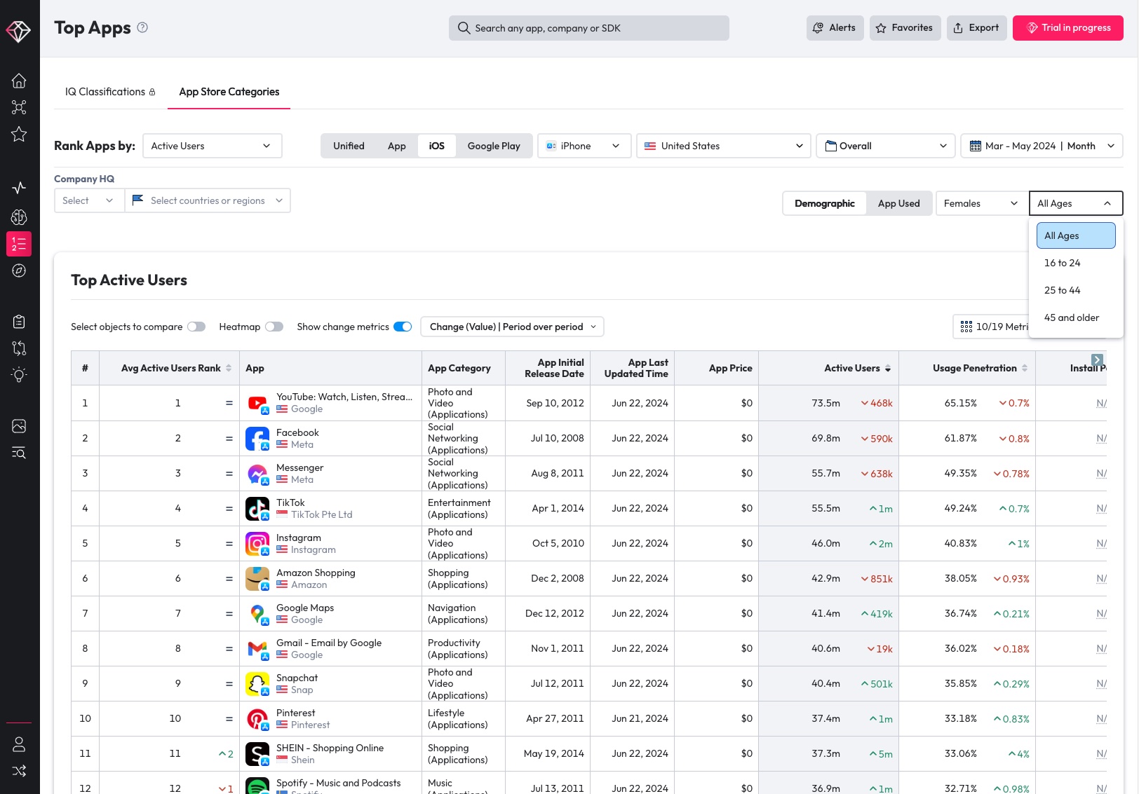
Renaming the products tabs and grouping the key portions of the metrics together was the first step in this redesign. Three core areas were separated to improve their discoverability: Ranks by Store, Ranks by Metrics and Ranks by Demographics. Each tab clearly identified the available metrics and data found within.
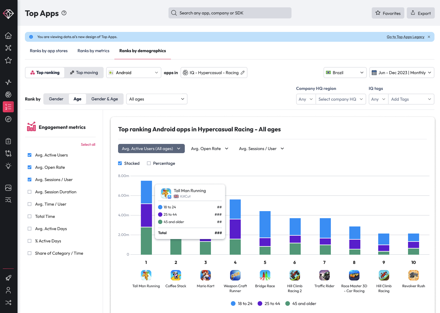
On the store ranks data, our lead designer used space and column to enable a cross-store rank comparison across free, paid and top revenue generating apps. In the Ranks by Metrics section, filters were again minimalized and moved from the top portion to scroll with the table content, keeping the sorting, filtering together. Finally, a new, dedicated demographics report was created. This report had previously been buried within a certain filter selection that most customers were unable to find without dedicated training from their account representative.

Top Movers
Applying the concept of “fast movers,” or apps with accelerated growth in one or more metrics, was the first design pattern that emerged in the design concepts. Fast movers enabled customers to quickly configure the report and visualization to discover breakout apps globally, regionally or even in a specific set of geos. It was a successful pattern that worked well for both the rankings use cases and for specific metric sets.
Demographics
The addition of the demographic report presented significant complexity, requiring additional help from our data scientists and back-end engineers. Google and Apple have different age ratings for their stores. These age labels shift going back through the history and maturation of the mobile app stores. Enabling clarity of the data and also communicating these limitations of the data set were paramount to an effective use of the demographics report. The team leaned into these challenges, providing new methods of combining the data from our Snowflake tables and adding visualizations to the demographics report, a new feature for the platform!
Ouctome
Each iteration of the report got us closer and closer to release. I was meeting with the squad and the designers and design leaders each week for reviews and critique. I had biweekly meetings with the CPO and monthly meetings with the CEO to keep them informed of progress, share recent mockups, and build buy-in for the new designs and features. The company was facing strong headwinds in the market and we were facing larger amounts of churn. These factors altered the risk tolerance of leadership, fearing that significant changes in the product might negatively impact customers.
Sensitive to leadership concerns, but also confident in the progress and improvements to the Top Apps reports, I nominated that we launch the new design alongside the legacy reports, but with a simple toast notification at the top of the report for customers drive awareness and promote using the new version. I also advocated for a longer, 6 week internal launch that we could use to gather feedback and gauge response. We had an existing Beta program, and made the case to launch the new design within the Beta program for select customers. Having the internal release and an upcoming Beta release gave our sales team the ability to provide demos for existing customers to gather feedback and solicit participants for the release. With this internal launch, I created surveys to gather quantitative feedback and worked with the squad to set KPIs that we could measure. I then worked with our PM and our front-end engineers to enable a longer window of time for internal release. The design leaders and product managers were also able to gather internal feedback prior to launch and quickly iterate on any bugs or issues uncovered in the internal release.
The feedback we received was overwhelmingly positive. Within the Beta release, we were measuring for usage across the existing Top Apps and new reports. We were also measuring that usage against the overall session depth of usage and time spent per session. Across all of these metrics, we saw an improvement of the new Top Apps usage of over 30%, with SMB and MM providing strong positive reactions to the updated designs. According to all the analysis that we had during the internal release and the Beta launch of 10 weeks, the new Top Apps design was ready to deliver significant improvements to engagement for our small and mid-sized businesses.
data.ai Product-led Growth