
Business Objective
In 2013, the digital marketing team set an objective to convert the main site into a responsive design. The desire for the redesign came from a need to streamline web design and development to free up resources for additional digital projects. At the time, GE Appliances.com had an estimated 12,000 pages within the site using fixed, desktop-only layouts. Maintaining the two sites; desktop and mobile, was time consuming and increased errors.
My Role
Upon joining GE Appliances as the UX Design Senior Manager, I took responsibility for overseeing the UX design of the new responsive site, including new style guide, layouts and testing plans.
Originally, IT and project managers had wanted to use agencies to complete the responsive site conversion. After six months of reviewing vendors proposals, the team came to the conclusion that our organization would not meet the time or budget objectives. I argued that we could complete the work internally with our own UX and IT teams within the constraints set by our business stake holders.
My approach enabled the team to replace the existing mobile-only site with a responsive one of greater functionality within 90 days. Within 16 months, the main site, the appliances parts ecommerce site, site search, the dealer locator service, and support sites were completely relaunched.
Strategic Planning
In the past, our organization ran waterfall-based projects. The tight timeline for the conversion project meant we all would need to work differently. I advocated for allowing the dedicated designer and developer to work co-located and to work in two-week agile sprints with critiques and reviews in a rest week.
Once how we would work was decided, we needed to prioritize which content would be converted first. The project management team gathered site analytics to evaluate the usage and traffic for pages, features and site content.
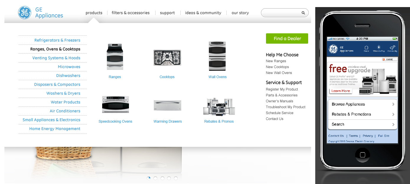
The team cross examined the mobile data with the desktop site and learned that product pages were the top priority across all devices. Once the team realized customers really only wanted to shop on their phones, replacing the mobile site with a responsive one become the highest priority for design and development.
Laying the Groundwork
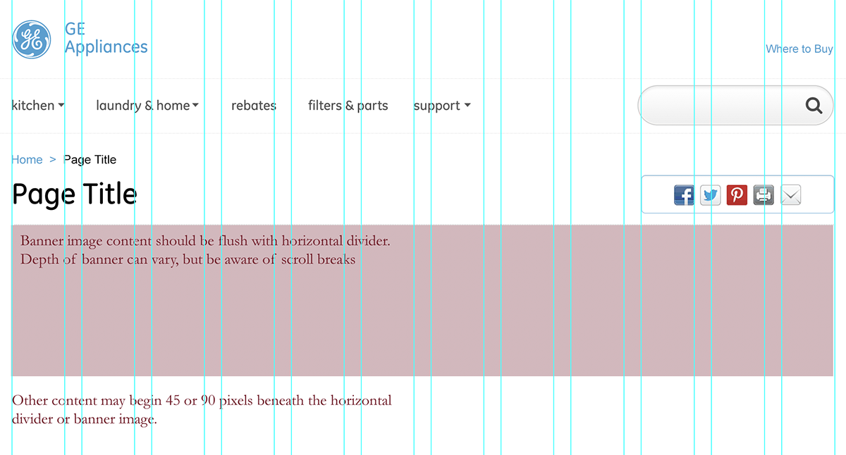
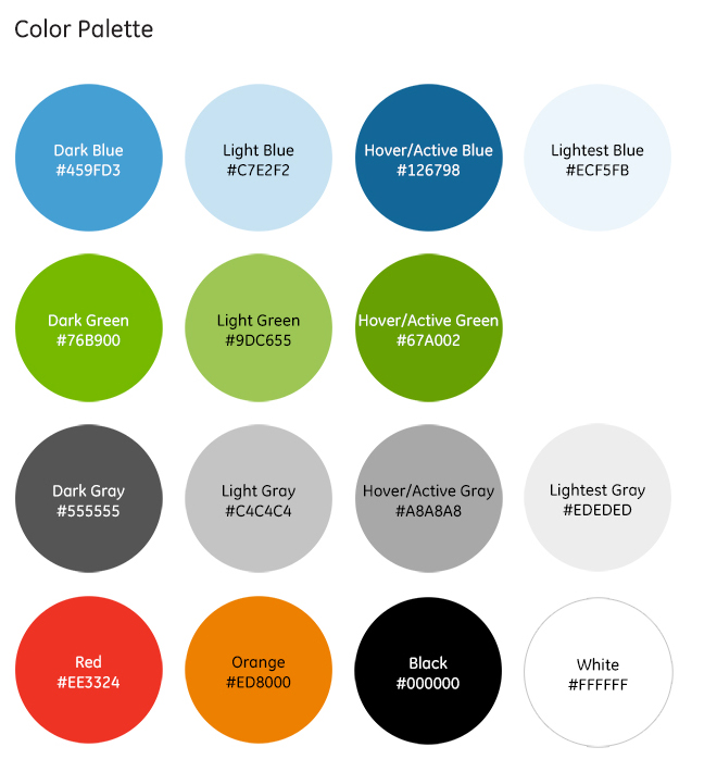
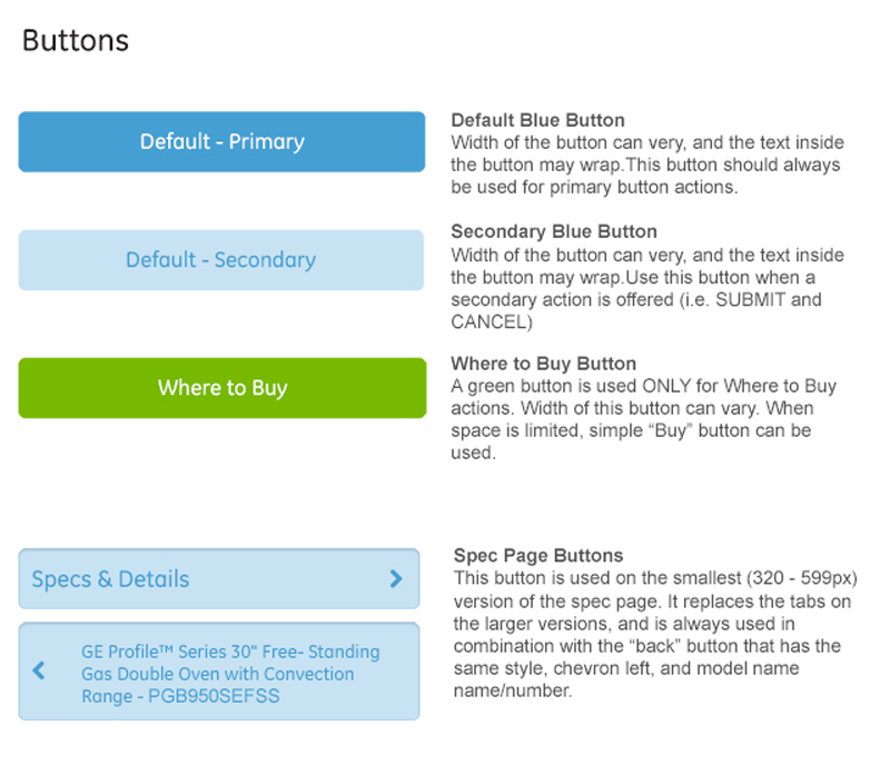
The design team was anxious to get started on the project, but knew that the most important piece of a successful redesign of this scope was the design system. The first two sprints were dedicated to the development of the design components that were critical to the project. The first sprint was focused on responsive type sizing, button styles, default typography, headings, and the grid were all designed, reviewed, critiqued and revised through the sprint process.

The second sprint focused on how best to handle the various formats of imagery found within the site. A key focus of the images was keeping the data overhead of the site low enough for ease of browsing and consumption on mobile without negatively impacting our users. At that time, the web standards for responsive imagery hadn’t yet reached a formal process, and the team used a clever compression formula and relied on caching and loading to minimize the mobile data load.
Test, Revise, Test Again
As the team got working on the design artifacts, it was obvious that rigorous testing would be needed to feel confidant that the site was working as expected. I worked closely with the development teams to research the browsers most commonly used on our site and those that were reported from web trend research firms. It was clear that we needed to support a wide array of older devices and browsers, so, we enlisted the help of Browserstack during the design and development process to test drafts. I also expanded the device testing lab we had already to include more mobile devices and set up a process for reporting results. We then staged the progress to a dedicated server and then set up enough time between each sprint and a large conference room for the entire team to test with one person acting as a scribe to gather all the bugs found. These would then be tracked and prioritized during the sprint review process.
This method of testing was, admittidly more time consuming than other projects, but enabled the site to progress with greater confidence. It also gave a greater exposure of the progress to stake holders and cross-functional teams. It also enabled the lead designer to move more quickly into the next design sprint, since the testing load was shared across a team of ten.
Expanding Resources
Within 90 days of starting the responsive project, the team had completed a full design of the product catalog and product pages. The team launched the responsive version and replaced the mobile-only version of the site. For the short-term, the team would maintain two sites; the responsive and the desktop versions, but we were energized after the success of the responsive initial launch. For the remaining bulk of the desktop site, however, it was clear that a divide-and-conquer strategy was a better approach.
Working with each designer, I identified a section of the site for them to prioritize into their weekly workload. Each relied on the design system, expanding it when a new element was needed for their respective sections. The design system was implemented across all the static content of the site, with new design layouts emerging to fulfill and modernize the look and feel of GEAppliances.com. As each designer put into practice responsive, mobile-first methods of visual design, they developed key expertise that would then roll into their other web-related projects. This process enabled the entire digital UX organization to become advocates for mobile-first design and development for the entire business.
Reaching the Finish Line
All told, the process for converting GE Appliances.com, dealer locator, appliances service & support, appliance parts, and the entire ecommerce platform took over 16 months. During the process of completing the design, the business leaders incorporated new agencies and services for the site, and the responsive design garnered the J.D. Power award for best manufacturers site three consecutive years in a row.